
Countdown bars
A countdown bar puts a visible, ticking deadline on an offer. It’s the simplest way to add urgency — and urgency is one of the oldest, most reliable nudges in marketing.
Settings
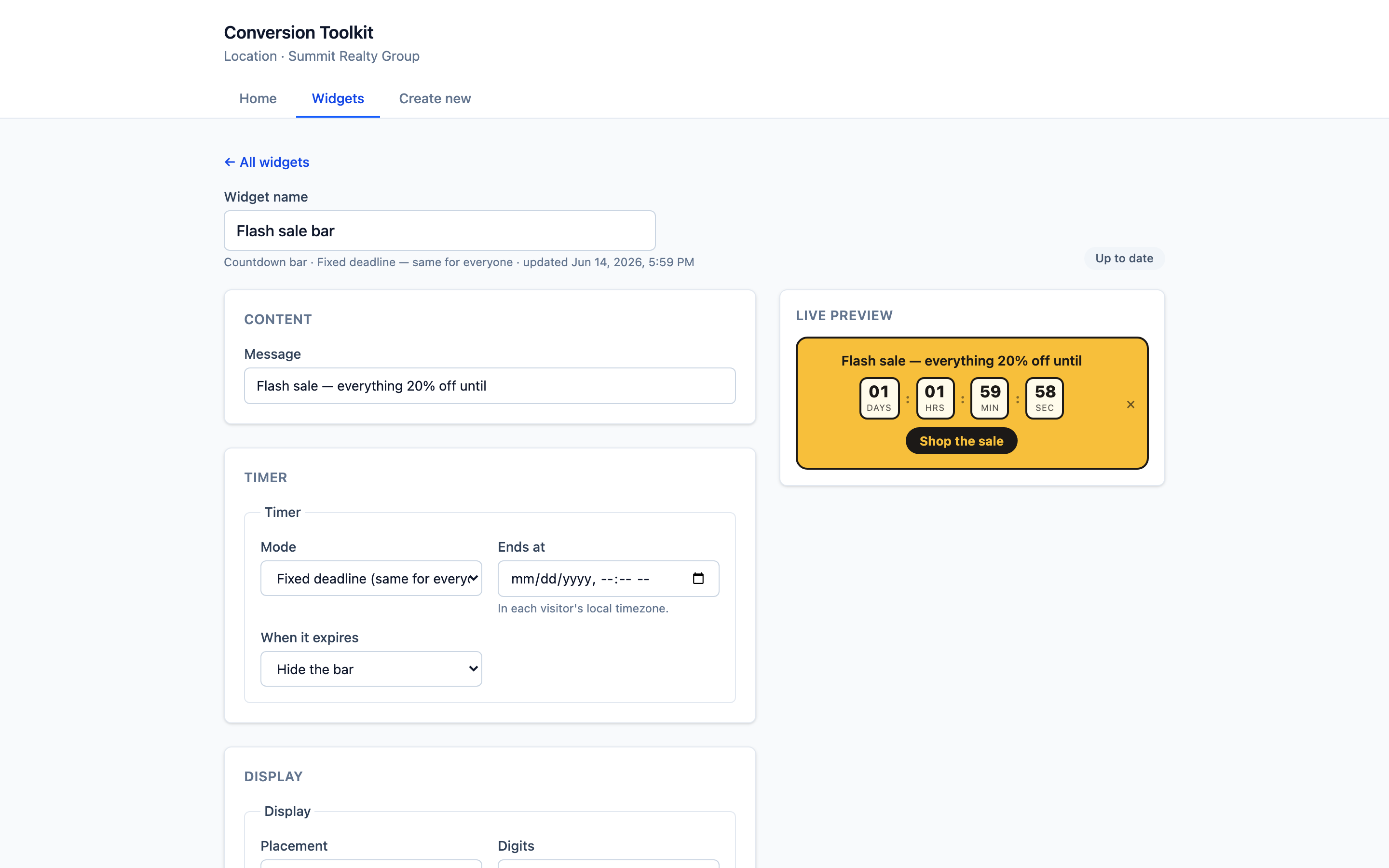
Content
- Message — the line shown next to the timer (e.g. “Flash sale — everything 20% off until”).
Timer
- Mode — how the deadline behaves (e.g. a fixed deadline that’s the same for everyone).
- Ends at — the date and time the countdown runs to. It’s shown in each visitor’s local timezone, so the deadline reads correctly wherever they are.
- When it expires — what happens at zero (for example, hide the bar).
Display
- Placement — where the bar sits on the page.
- Digits — how the time units are shown.
Theme
Style it to your brand with a preset and overrides. High-contrast looks like Bold pop suit countdowns well — you want it noticed.
What visitors see
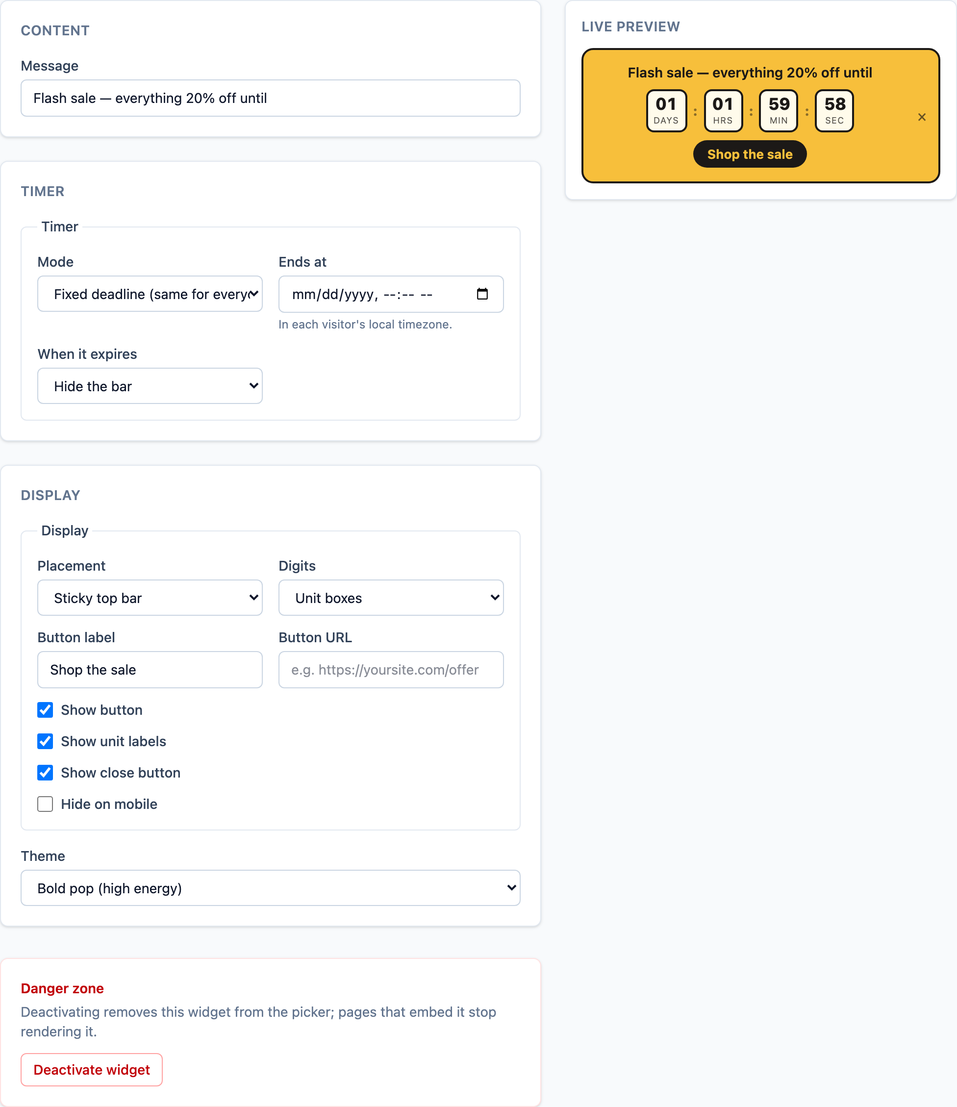
A compact bar with days / hours / minutes / seconds ticking down, plus your message and a button.
Good to know
A countdown is an urgency widget — it doesn’t capture leads itself. Point its button at the offer, form, or calculator you do want to convert, and let the deadline do the pushing.
When to use
- Sales and promos with a real end date.
- Launches and enrolment / registration deadlines.
- Cart / checkout pages to discourage “I’ll decide later.”
Tips
- Use a real deadline. False urgency that resets every visit erodes trust fast.
- Pair the message with a clear, single call to action.
[1] FOMO consumer research (Strategy Online), widely cited — verify primary source. [2] Marcus Taylor, A/B case study published on CXL — figure widely cited; confirm exact number before quoting.