Display modes
Calendar Events ships with four display modes. They all read from the same calendars and settings — only the layout changes. Set the mode under Display in the widget settings.
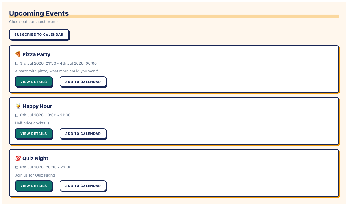
List
The default. A vertical stack of compact event cards — title, date/time, location, and an optional description. Good for a sidebar, a footer, or anywhere space is tight.
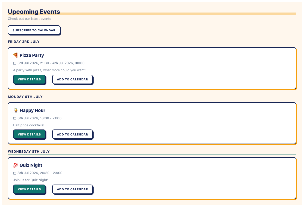
Agenda
Events grouped under date headings, so visitors can scan what’s happening across the coming days or weeks at a glance. A good middle ground between the compactness of List and the structure of a calendar grid.
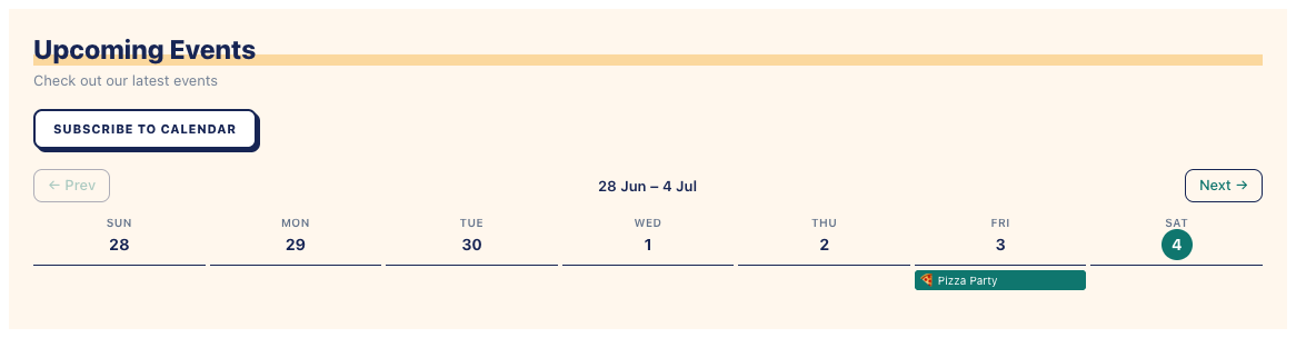
Week
A 7-column grid showing the current week, with events as labelled blocks in their day’s column. Visitors can step forward or back a week at a time with the navigation arrows. Clicking an event block expands a full event card below the grid; clicking it again collapses it. Good for businesses with frequent, recurring events (classes, sessions) where “what’s on this week” is the main question.
Calendar
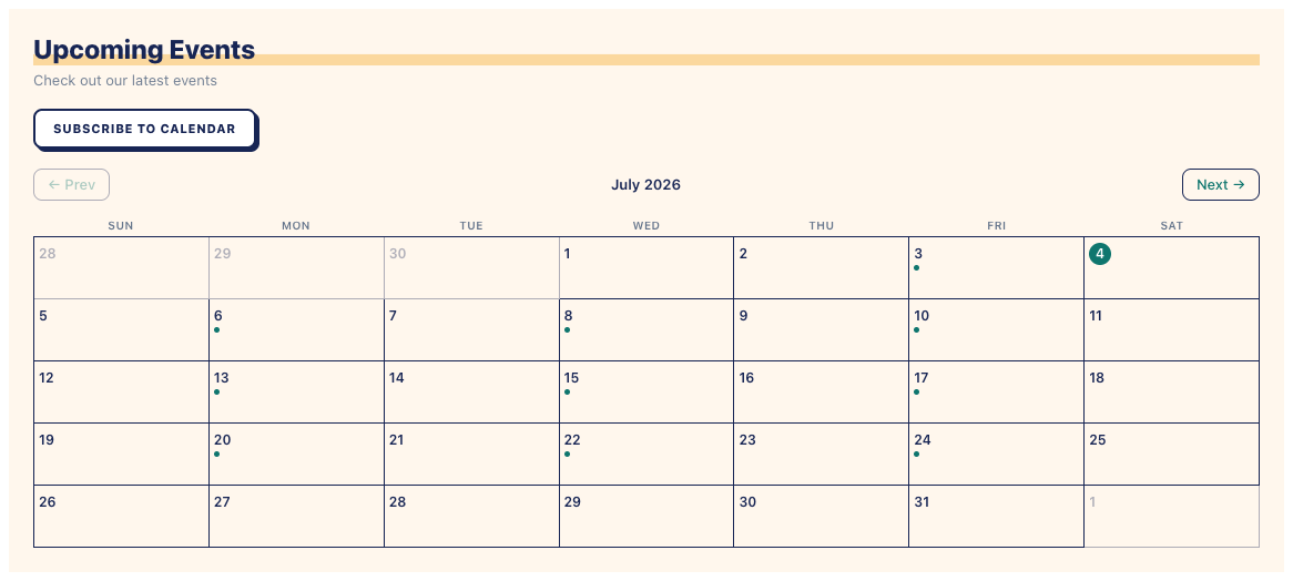
A familiar month grid with a dot or label on any date that has events. Clicking a date shows that day’s events below the grid. Best for a dedicated events page where visitors expect to browse by date.
Switching modes
Changing the display mode is a setting, not a rebuild — switch any time in the widget’s Display settings and every page using that widget updates immediately.